[This page is outdated! See instead the wiki page: https://wiki.project-tamriel.com/wiki/Interior_Modding_Tutorial]
A new tutorial on how to create dynamic and believable interiors for Morrowind by Thrignar Fraxix. You'll never need another tutorial for interiors, guaranteed!
Ladies and Gentlemen, I have been called upon from the depths of reviewing hell to teach you all how to make interior cells all nice and pretty-like. Though I will be lighthearted in my tone, I am dead serious in all that I say, so take none of this lightly. This is how it is done.
BASICS:
I'm going to assume you know how to make a file and load the requisite masters. The interior I am making is going to be a poor Hlaalu duplex/triplex in the ferry district of the Hlaalu capital, Narsis.
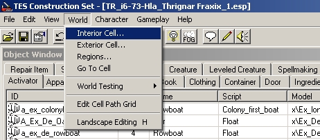
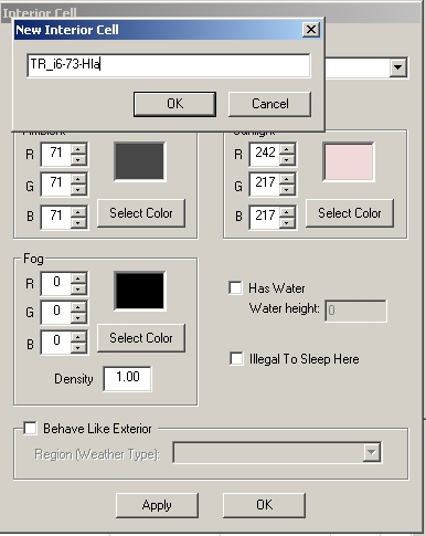
Select the World Tab, then Interior Cell. From here, select New:
Here I entered the cell name. The convention is TR_i#-#-***. The first number is the map, found in your claim ID. Second is the ID of that claim. Finally, the *** represents three letters that represent the house of the claim. (Red-Redoran, Hla-Hlaalu, Ind-Indoril, Dre-Dres, Tel-Telvanni, Tri-Tribunal, Imp-Imperial) This convention is no longer used, see below.
Our current naming convention for dungeon interiors is TR_[Exterior Claim Acronym]_[Type of Interior]_#
For example, the claim "Lake Andaram 2 Tomb 1" would have the claim name TR_LA2_Tomb_1
- TR stands for Tamriel Rebuilt (you would use PC_ or Sky_ for claims in Cyrodiil or Skyrim)
- LA2 stands for Lake Andaram 2, the name of the exterior claim that has this tomb
- Tomb is the type of interior
- 1 is the number in the claim name (the number is dependent on the type)
For cities or some multi-claim dungeons the convention is TR_[City Name]_#_[Description]
For example, the claim "Aimrah Interior Claim 2: Sailors' Inn" would be named TR_Aimrah_2_Sailors' Inn (spaces in the city name or interior description remain spaces)
If you have multiple interior cells in your claim, add "_[Description]" to each (optionally not to the main cell) These can be as barebones as TR_LA3_Grotto_1_Upper and TR_LA3_Grotto_1_Lower.
When an interior is merged into a section file, it will initially begin with TR_, but should be given a proper name after being NPCed.
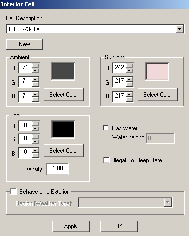
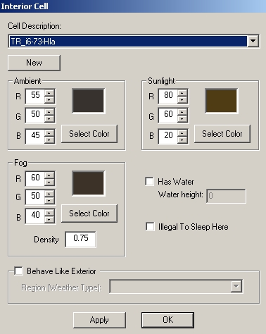
With the cell created, you will notice that the lighting values are odd. These are not good and need to be changed. Think about the exterior region in which your interior is placed. Either use your godly powers of deduction to create good lighting settings from scratch (don't), or find a similar vanilla situation, take the lighting settings from them, and edit to reflect the differences in mood between that interior and yours.
A little bit goes a long way with lighting, so don't overdo any changes. Also, I almost made a mistake here. Don't forget the "Illegal to Sleep" box if your interior is a building. (No one cares if the player sleeps in a cave)
Now what?
We Click the Static tab and scroll down to the Hlaalu interior pieces. Statics are divided into many sub-categories by name which are listed in detail at /old_forum/viewtopic.php?t=3837
Enable grid snap and angle snap:
Before we start, we want to check the exterior for this claim.
My claim is #7. That building is ex_hlaalu_b_12. You should always check to make sure your interior matches the exterior shell. You should also load up the actual exterior in the construction set and make note of the angle of the door for your building. Every interior needs a northmarker (found under the statics tab) and that north marker needs to point north. How do you find north? Simply take the z rotation of the exterior door and subtract from it the rotation of the interior door. This gives the angle for your north marker. Some sets might be special though, so be certain to make sure it lines up properly. If there are problems, switch the numbers you subtracted around and that should work.
If you are unsure how your claim should fit the exterior, just place shell pieces to fit the edges. Interiors are generally a little bit larger than their exterior. (More so with imperial forts and Indoril claims, but still not much). Another idea, if your exterior is strange. Look at other interiors with your exterior's shell. This is only a bad idea when dealing with Hlaalu claims. These often don't fit the exterior on a hilarious level. Generally we opt to do it right, though when it comes to Hlaalu guard towers, we begrudgingly accept Bethesda’s standard layout.
Looking at my claim, it appears it should be shaped as such. I based this off the interior for Ules Manor, ignoring the staircase at the back that I felt made the building too deep. This interior is supposed to have two or three homes inside. I can envision the splits in a way that would make for three homes.
I have made the splits here. Look through the pieces of each set and familiarize yourself with them. Some sets have special ceilings (Hlaalu, common, and Indoril) that you have to check. This is easy to miss, but important nonetheless. I won't go into specifics about the individual placement of interior shell pieces. I trust that you can handle that unaided. Doors are naturally under the door tab, and are specific to the tilesets. When placing doors in doorjambs, generally gridsnap gets them into place, however in my experience some doors have to be manually adjusted (Imperial non-loaddoors are the only ones I can think of offhand). Always check your doors to make sure they rest properly in the doorjamb.
For the purpose of this tutorial, I will only show myself making one room. This should be enough of a demonstration.
A 2x3 room with a single square for the entrance. Probably the most important step of this creative process is deciding what you want to make. One of the residents is a Redguard abolitionist according to the claim description, but I think I will put him in another room. I think this will be the home for a small scum of the earth Breton family. (Two parents and an adult daughter) Throughout this interior, the furniture will be de_p, which can be found under the static tab. I'm going to place a few pieces to get the general layout of the interior going. de_p doesn't have a wallscreen, but you can use furn_de_screen_guar_01. I used a de_p_closet_02_de_fclot, which is a closet with female clothes, and de_p_chest_02_mclothes3, which is a small chest with male clothes, to show that this house is has more female residents than male residents. Beds can be found under the activator tab. The ones I used here are: active_de_p_bed_05, a poor double bed for the parents, and active_de_bedroll a single sized floor mat for the daughter. Rugs are Furn_de_rug_big_08 and furn_de_rug_01. There are shape and color variations around these in the static tab.
Next up is placing things on the surfaces. This isn't always much of a problem, but de_p furniture hates you and your loved ones. It requires special care. Below you can see a light_de_lantern_05_128_Carry (from the light tab) placed on a poor bookshelf. I had to rotate it a single degree to make it match the slanted lie of the shelf. Double click items to open up a window that allows for specific rotations. Note though that you shouldn't click save as that edits all instances of the item, dirtying your file.
Looking at the whole shelf, you can see that sometimes you will have to rotate more or less than a single degree. It should be done with precision and a careful eye. It isn't nearly as hard or tedious as it sounds.
I'm not going to fill this review with every instance of me placing and rotating items to fit poor furniture (that would be unnecessary and excessive), but it is always important to check everything you place. Also, try to make things interesting and give the NPCs personality. The Father is a terrible drunkard who fears people will come after him for the money he owes. The other roles are less defined, but they do feel like people.
The final step is to look over the finished product. Check how your placed lights look in game, as the CS doesn't always show things the same way, and overall make sure you can maneuver through the interior and that it looks good.
Entering the room things seem good, but upon closer inspection I see two problem spots
The strange yellow lights seen in these two images (and highlighted on the chair) are a strange thing that you need to watch out for with light objects. Generally, like in the case of the mazte, it is because an object is too close to a light. The chair is a strange case I can't quite explain though, and serves to highlight the fact that you should always check your work. I fixed these problems by removing the mazte (three on one shelf was a bit much anyway for a house), and moving the chairs out. Though I am not going to upload screenshots to show the fixes, rest assured that they were made easily.
Some things I want to address that didn't come up during this tutorial:
- Custom objects.
The simplest way to do this is to find another object with the desired model, click the name until it becomes a text box, then enter a new name (preferably one that makes it apparent you made the object). After you hit return, the CS will ask you if you want to make a new object or edit the old one. Select that you want to create a new object naturally. To edit the contents, double click the name of the object in the object window, then find the contents in the other tabs, and drag them into the container. If you want multiples of an object, and don't want to drag them all in, simply click the quantity number, turning it into a text box, and enter your desired quantity. After all of this, click save. Always name custom objects based on the name of your interior, and beginning with "TR_", or "PC_" for Cyrodiil interiors and "Sky_" for Skyrim interiors. "T_" is only for objects in Tamriel Data. - Cleaning files.
Sometimes while modding, you might edit things you don't mean to edit. (Click save on an object you don't mean to, creating more custom objects than you actually need, etc.) Using TESAME, open your file. Going through the list, select any object you didn't make yourself, and then press the spacebar, then delete. Save your file, and then you are done. (Note, this isn't for interiors, but never delete land textures. It is so important that you don't do that when modding exteriors that it should be mentioned in an interior tutorial) - If you want to hide parts of your interior from the ingame map, use "In_Lava_Blacksquare"s. These can be scaled up or down and rotated to fit.
This concludes this tutorial. Remembering to place things properly, check your work, and be creative will ensure that you are successful in your modding. It isn't particularly difficult to mod well; just don't rush yourself.
Tutorial by Thrignar Fraxix
